eBazar
A product review flow that people actually finish
Context
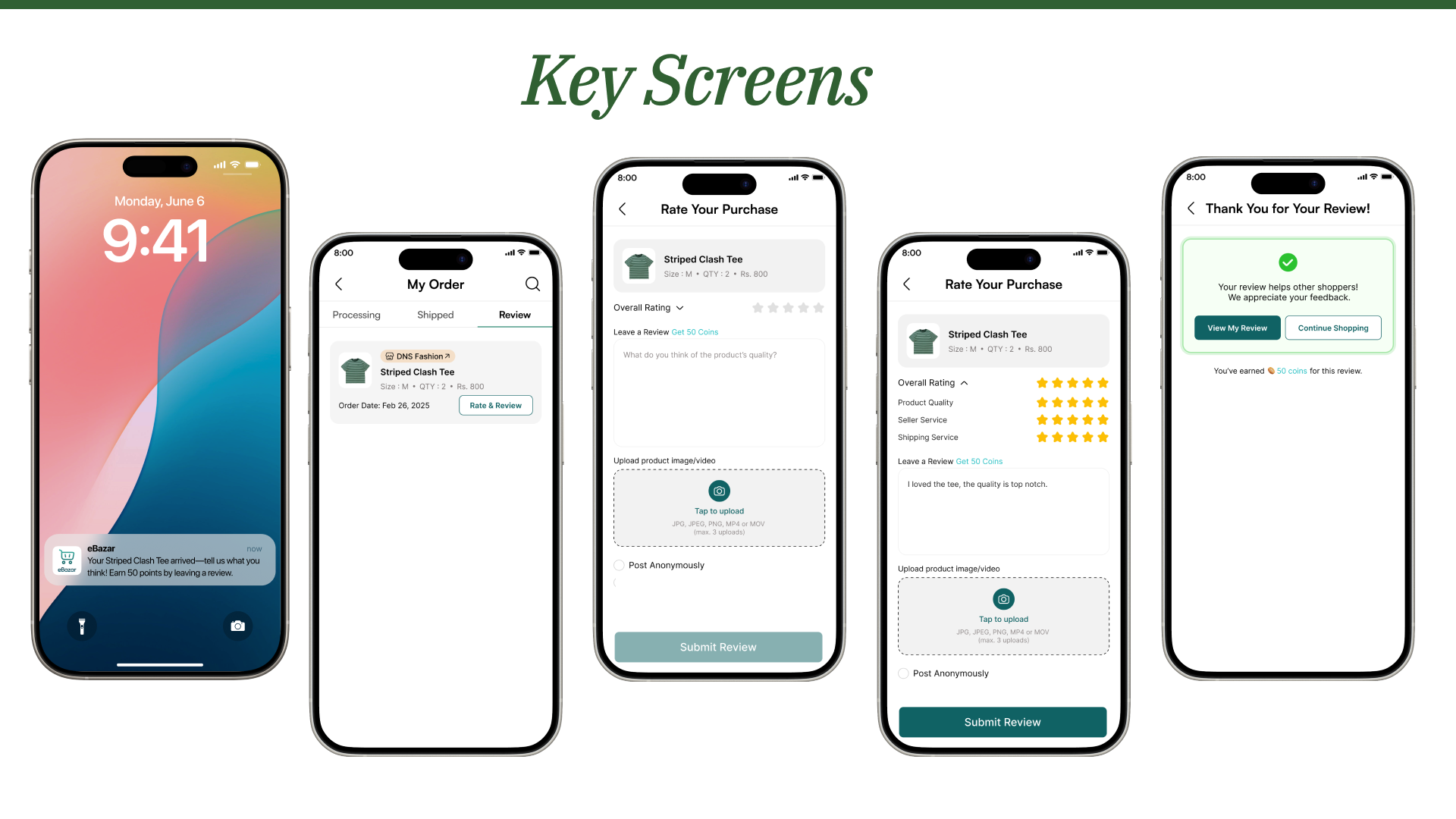
Reviews are the thing shoppers trust most and the thing they are least willing to write. eBazar is a self-directed project where I redesigned the post-purchase review experience end to end, from the prompt that arrives when the parcel does to the reward that lands when the review is submitted.
The brief I set myself was to make reviewing feel like a thirty-second job rather than a chore, without letting the incentive turn the ratings into noise.
The flow
Four steps, each one designed to hand the user to the next with as little friction as possible.

Why it is built this way
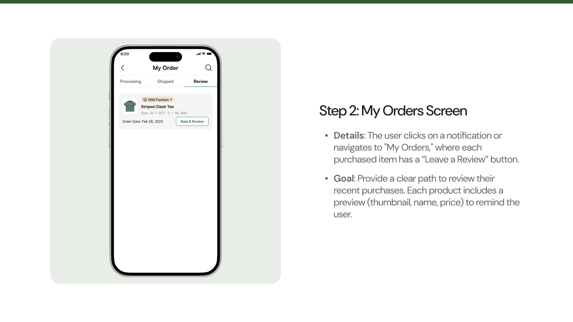
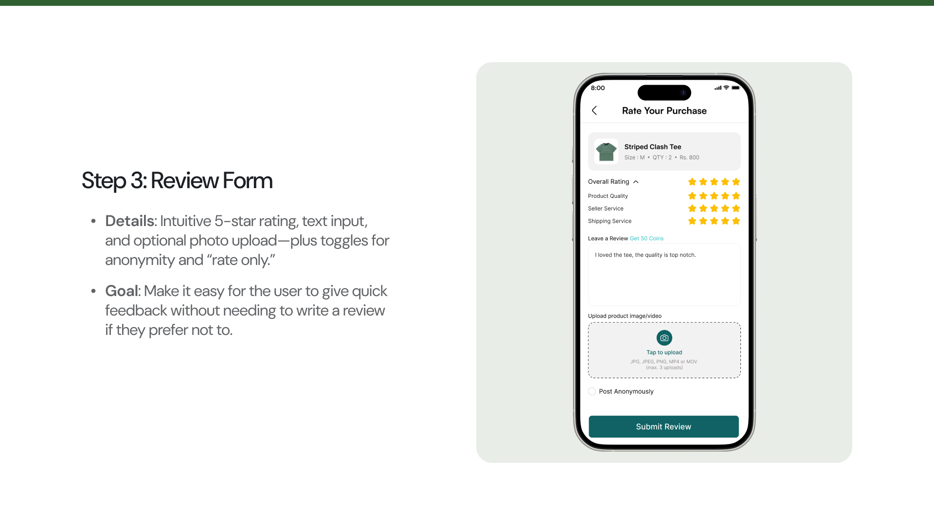
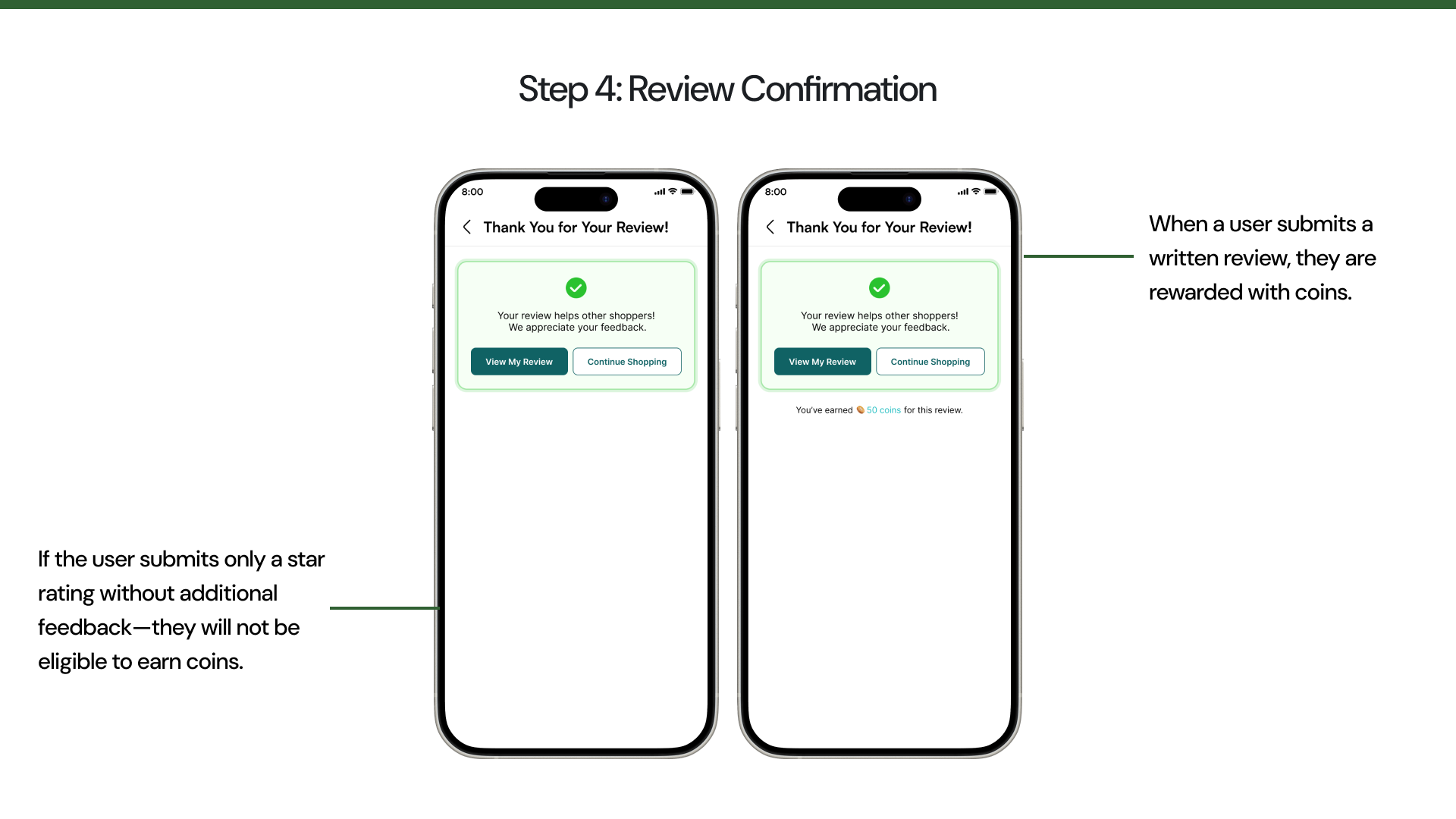
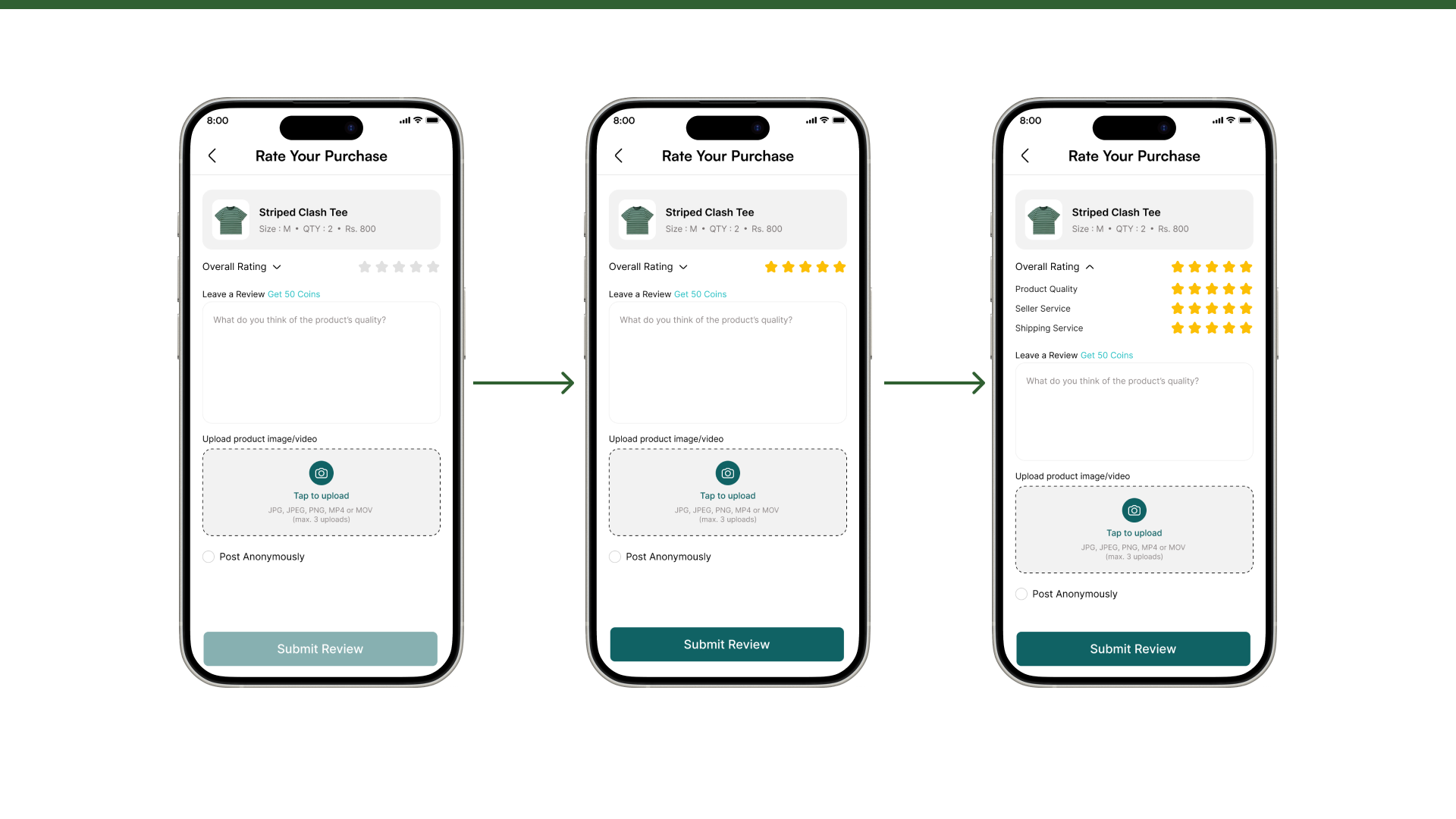
The prompt fires when the order is marked received, while the product is still in the user's hands, and it names the item and the reward in one line. Notifications get dismissed, so the same review also waits in My Orders with the thumbnail, size and price attached. Rating comes first and writing is optional: five taps on a star row is never blocked behind a text field, and submit activates as soon as a rating exists, whether or not anything is written. The score splits into product quality, seller service and shipping, because a late delivery and a bad t-shirt are different complaints. Posting anonymously sits in the form rather than buried in settings, since honest criticism is easier to give unattributed. Coins go to written reviews only, as paying for stars would fill the catalogue with five-star noise. And the photo field states the formats and the three-file limit before anything is picked.
What I would look at next
This is a concept piece, so the obvious gap is evidence. The two things I would want numbers on are whether the split ratings get filled in or skipped, and whether the coin reward changes review volume without changing the average score. The second one is the risk: an incentive that moves ratings is worse than no incentive at all.
See it in Figma
Try the clickable prototype, or read the full presentation with every screen and the flow between them.
Other projects