Glam
A beauty storefront, and the two decisions the whole page rests on
About the project
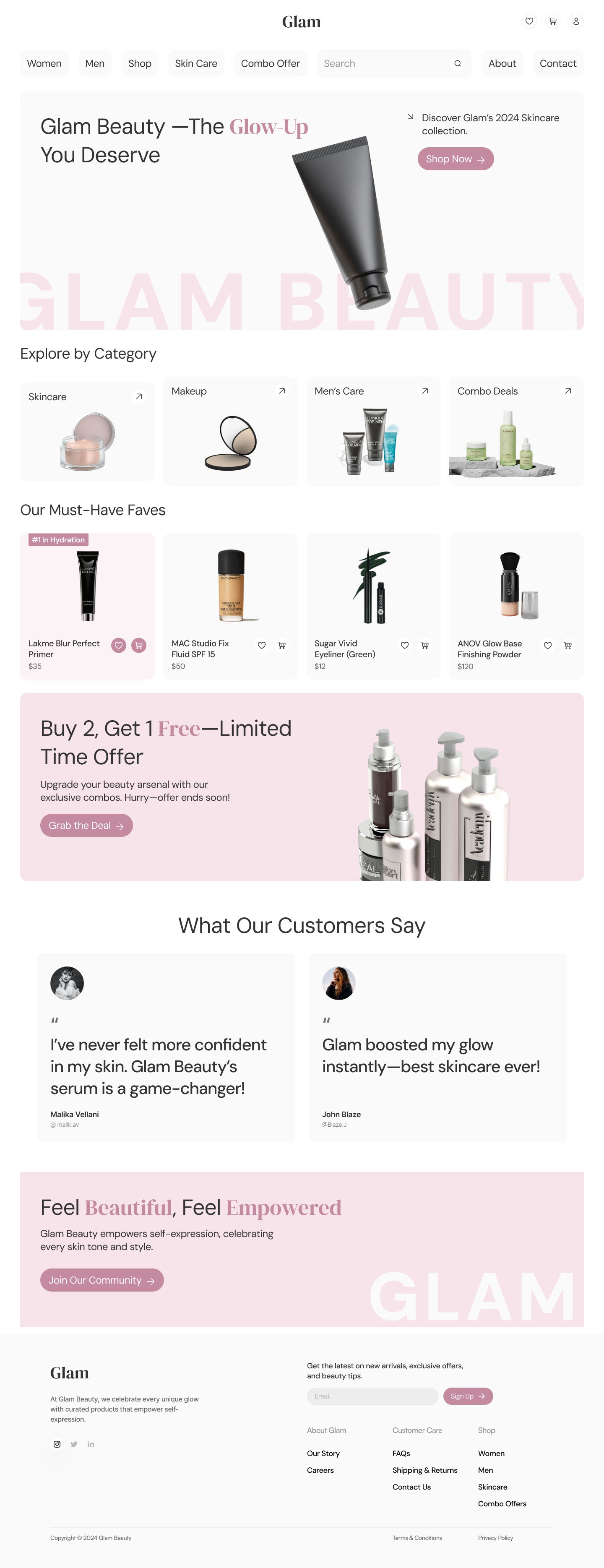
Glam is a beauty and skincare brand concept. I designed the full landing page: navigation, hero, category browse, a best-sellers row, a combo offer, customer quotes, a community call to action and the footer.
This was a self-directed visual exercise rather than a product problem, so there is no research or testing behind it. What it shows is how I handle brand, colour and type on a page that has to sell something.
The page in full
Every section, top to bottom.
Colour
One rose, used sparingly on a near-white page, marking the things you can click. A paler version of the same hue does the decorative work. The product photography supplies the rest.
- #C48A9F Rose. Buttons and the highlighted word.
- #F7E4EA Blush. Watermark, icon outlines, tinted panels.
- #FAFAFA Panel. The blocks each section sits in.
- #FFFFFF Page. The gutter between panels.
- #333333 Text. Softer than black.
- #666666 Secondary text. Prices, captions, footer.
Typography
DM Sans throughout, with DM Serif Display for the wordmark and the one highlighted word in the headline.
Details
Rounded pills for the navigation and buttons, 16px corners on the panels. Cart, wishlist and account sit in circular buttons outlined in blush rather than grey. Product cards carry an image, name, price and two actions, and nothing else.
Other projects